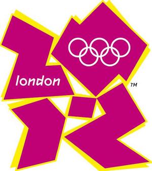
When the logo for the London Olympics was unveiled in June 2007 at the cost of £400,000 there was significant public uproar due to both the cost and how terrible it looked.
Despite public pressure, the International Olympic Committee stood fast on keeping the logo, with no flexibility. In other words, this particular logo was very important. Why?
There are many interpretations spread about the net, all intended to dissolve the true symbolic meaning behind the logo. It has been claimed to look like a swastika, a runner and even Lisa Simpson but these are all ridiculous diversions.
On first glance you can easily make out the numbers 2012, but why the random ‘dot’?
Here’s why (image credit: Ian Crane):

Are we to believe that the London 2012 Olympics are going to facilitate the implementation of Zion – the ‘New Jerusalem’?
To recite William Blake’s poem ‘Jerusalem’:
And did those feet in ancient time
Walk upon England’s mountains green?
And was the holy Lamb of God
On England’s pleasant pastures seen?
And did the Countenance Divine
Shine forth upon our clouded hills?
And was Jerusalem builded here
Among these dark Satanic mills?
Bring me my bow of burning gold:
Bring me my arrows of desire:
Bring me my spear: O clouds unfold!
Bring me my chariot of fire.
I will not cease from mental fight,
Nor shall my sword sleep in my hand
Till we have built Jerusalem
In England’s green and pleasant land.

Whats wrong with you British nations?!!
You have the Great Britain nation, NOT Zion…..!!!